


Tech’s “hubristic dominance”, an epic polarisation of returns and central banks buying $1.4bn of financial assets every hour appear to be some of the defining features of 2020. 
This is according to Bank of America (BofA), which has released its ‘annual primer’ on the size, composition, risks, returns, leverage and valuations of the bond and equity universe – which comes as the coronavirus pandemic continues to cause significant upheaval.
Below, Trustnet highlights 10 of the most interesting charts from the report as well as 20 must-know stats about the year so far.
Global equity & debt securities outstanding, ($trn)
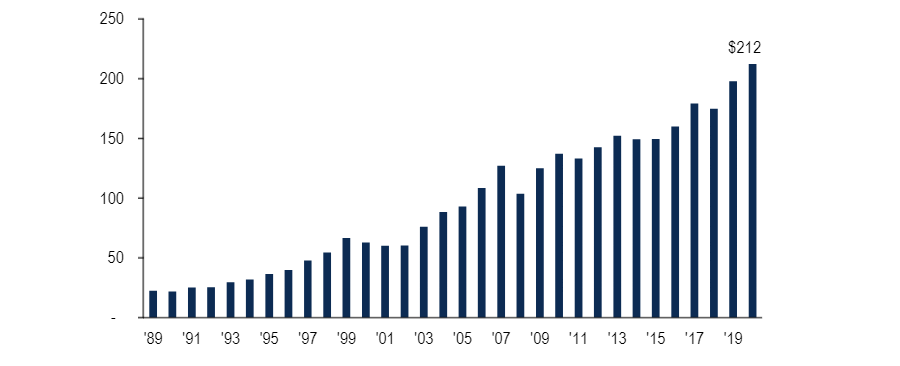
Source: BofA Global Markets, OECD Capital Market Series Dataset (2019), Factset, Thomson Reuters, Bloomberg
Bank of America kicks off its report with the above chart, showing how the size of the global equity and debt market has grown over time: it has risen to $212trn this year and is now 2.3 times the size of global GDP.
The value of total equities is estimated to have increased $5trn in 2020 to almost $100trn while $9trn has been added global debt securities outstanding, taking their total to $113trn.
Since the coronavirus lockdown of March, global central banks have bought $1.4bn of financial assets every hour, according to BofA analysts.
“For much of the past 10 years Wall Street has proved ‘too big to fail’ and monetary policymakers have implicitly supported asset prices to boost economic growth; in 2020 the policy is more explicitly engineering an overshoot in asset prices to end recession,” they added.
The asset class quilt of total returns
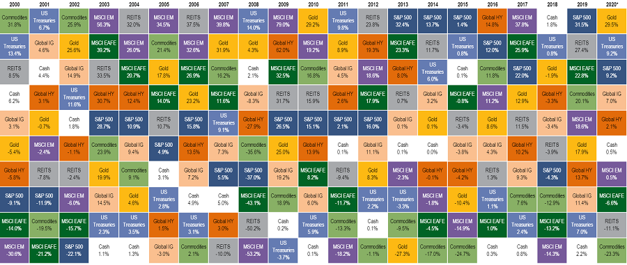
Source: BofA Global Markets, Bloomberg. YTD returns, as of 1 Sep 2020
Here we have a table showing global cross-asset total returns since 2000, in US dollar terms.
Gold has returned 29.5 per cent in 2020 so far to make it the best performing asset class after the coronavirus crisis and record lows in interest rates heightened the safe haven’s appeal.
The last time the yellow metal was the best performing asset class for a full calendar year was 2010 – when investors were growing nervous about the growing eurozone debt crisis.
Wider commodities, however, have been the worst performers over the year so far after widespread lockdown’s hammered demand.
The quilt of equity returns

Source: BofA Global Markets, Bloomberg. YTD returns, as of 1 Sep 2020
Narrowing in on how regional stock markets have performed, China is topping the table by a wide margin.
Although the coronavirus originated in China and the country was the first to lock down, it restarted its economy first as well and appears to be bouncing back quicker than developed markets.
BofA noted that China (12.7 per cent), the US (7.2 per cent) and Germany (2.5 per cent) are the only markets with a positive return over 2020 to date. The UK languishes in last place on the table, following its inadequate response to the pandemic and the ongoing Brexit struggle.
Top five companies as % of S&P 500 market cap
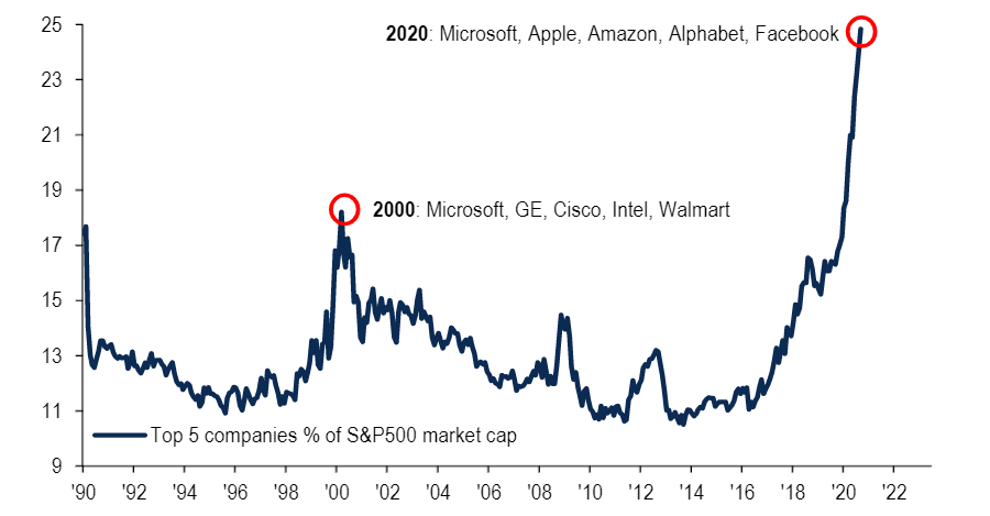
Source: BofA Global Markets, Bloomberg
While the US has made some of the strongest returns of the year, the above chart suggests how focused these gains have been among a handful of tech stocks.
“The concentration of market cap in large-cap tech stocks is a defining feature of 2020,” BofA said. “Currently the market cap of FAAMG (Facebook, Apple, Amazon, Microsoft and Google) as a share of the S&P 500 is 24.8 per cent, an all-time high.”
At the height of the dotcom bubble in 2000, the five largest tech stocks grew to account for 18.2 per cent of the index.
Tech & healthcare vs financials & energy as a % of global equities
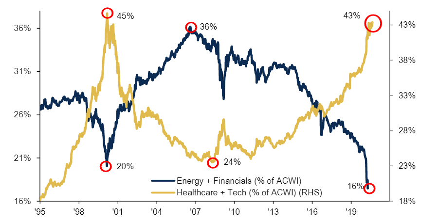
Source: BofA Global Markets, MSCI
Debate continues over how long the outperformance of the growth style over value will be maintained, having been in place for much of the past decade. However, 2020 has certainly failed to act as a catalyst for value’s fortunes.
“The concentration of market cap in growth sectors is another defining feature of the global equity landscape in 2020,” analysts at BofA said.
“The tech and healthcare sectors currently represent 43 per cent of global equity market cap; by contrast the market cap of financials and energy has shrunk to just 16 per cent – down from 36 per cent in 2006.”
Global debt climbs to another new record in 2020
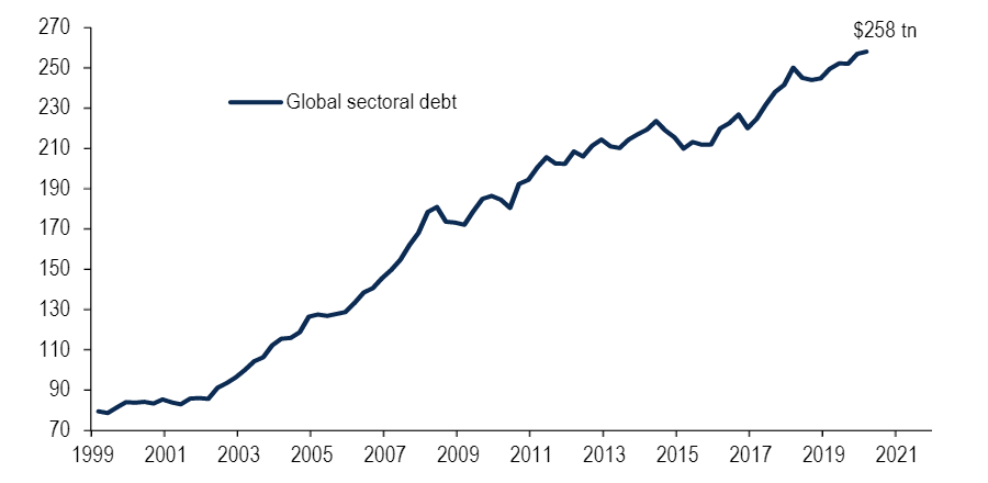
Source: BofA Global Markets, BIS, IIF
The above chart shows how debt has climbed to a new record in 2020, as governments around the world upped borrowing to launch massive stimulus programmes in the coronavirus crisis.
Global debt growth is outpacing GDP growth, which BofA’s analyst said suggests lower returns for each dollar borrowed and leads to a steady build-up in indebtedness. Global debt equalled $258trn, equivalent to 280 per cent of world GDP, at the end of 2020’s first quarter.
“The disconnect between high leverage and low interest rates is very easily explained by financial repression, the intervention of central banks in fixed income markets to fix yields at very low levels to help service the debt burden,” the analysts added.
They also said that there is no better representation of financial market repression than the new asset class of ‘negatively yielding bonds’. There are $14trn of bonds on negative yields at the month.
Evolution of the biggest ‘tail risks’
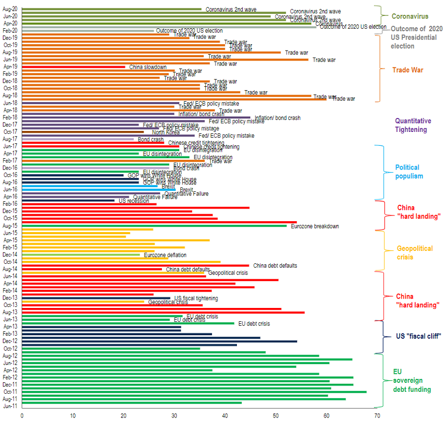
Source: BofA Global Fund Manager Survey
In the closely watched BofA Global Fund Manager Survey, asset allocators around the world are asked what they see as the biggest threat to financial markets each month.
While coronavirus is predictably top of the list at the moment, the history of the survey shows that recent concerns have included populism (2016/17), quantitative tightening (2017/18), trade war (2018/19), China slowdown (2019) and outcome of US election (early 2020).
Dividend yields (%)
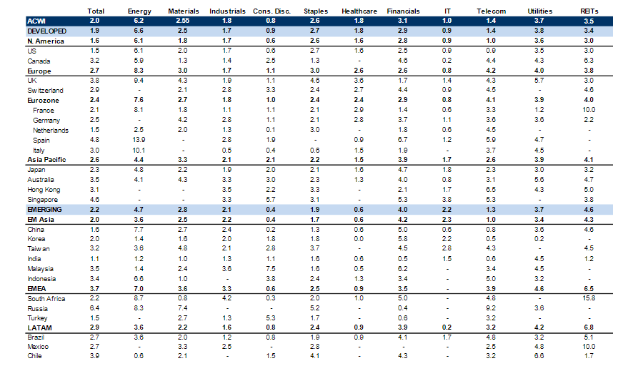
Source: BofA Global Markets, MSCI, as of 31 Aug 2020
Moving over to various valuation metrics, global equities currently yield 2 per cent but there is a wide divergence on both geographic and sector levels.
Dividend yields in excess of 3.0 per cent – which indicate ‘cheap’ assets – including the UK, Canada, Spain, Australia, Hong Kong, Singapore, Taiwan, Malaysia, Indonesia, Russia and Chile as well as energy, financials, utilities and Reits.
‘Expensive’ areas, defined by those with yields below 1.5 per cent, include the Netherlands, India, consumer discretionary, information technology and telecoms.
Forward P/Es
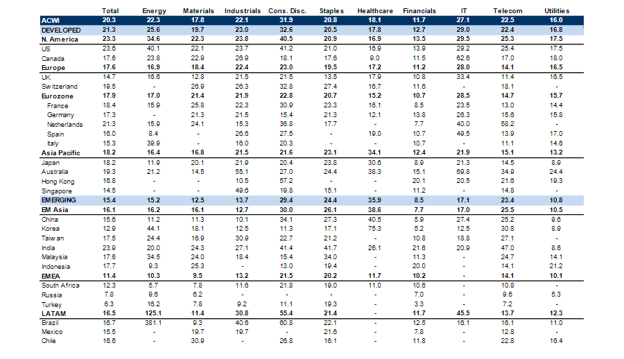
Source: BofA Global Markets, MSCI, as of 1 Sep 2020
This table shows price/earnings ratios based on 12-month forward earnings. Global equities are currently on a forward P/E (price-to-earnings) multiple of 20.3x.
P/E multiples above 23x (or expensive areas) are seen in the US, India, consumer discretionary and IT. Cheap areas with P/E multiples below 15x include the UK, Singapore, Korea, South Africa, Russia, Turkey and financials.
A chronology of crowded trades
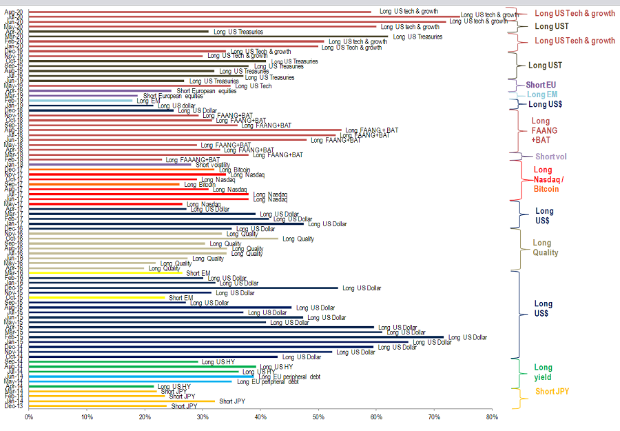
Source: BofA Global Fund Manager Survey
The final chart shows the trades that fund managers surveyed by BofA consider to be the most crowded at any given time.
Being long US tech and growth stocks is currently seen as the market’s most-crowded trade. These areas led the post-financial crisis bull market and have continued to surge in 2020 as well.
Past crowded trades highlighted by the BofA Global Fund Manager Survey include long Nasdaq/bitcoin (2017), short volatility (2018), long FAANG+BAT (2018), long US dollar (2018/19), long emerging markets (2019), short European equities (2019) and long US treasuries (2019/20).
20 must-know stats for investors for 2020
BofA’s analysts also highlighted 20 stats that might help investors put the unprecedented events of 2020 into some kind of context:
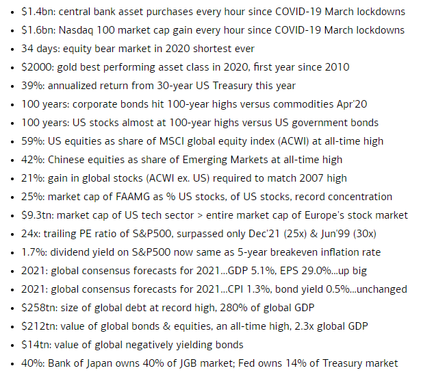
Source: BofA